

Full brand & website redesign as well as a product design.
Angie originally approached me needing a couple graphics created for a new kids campaign she planned on running. We quickly learned how well we worked together and decided to rebrand her company and redesign her website.
Angie Stewart Fitness targets working mothers, providing fitness information (workouts, recipes, motivation, one on one training) for every lifestyle. Her site is still being developer, but as soon as it's launched I'll include the link below.
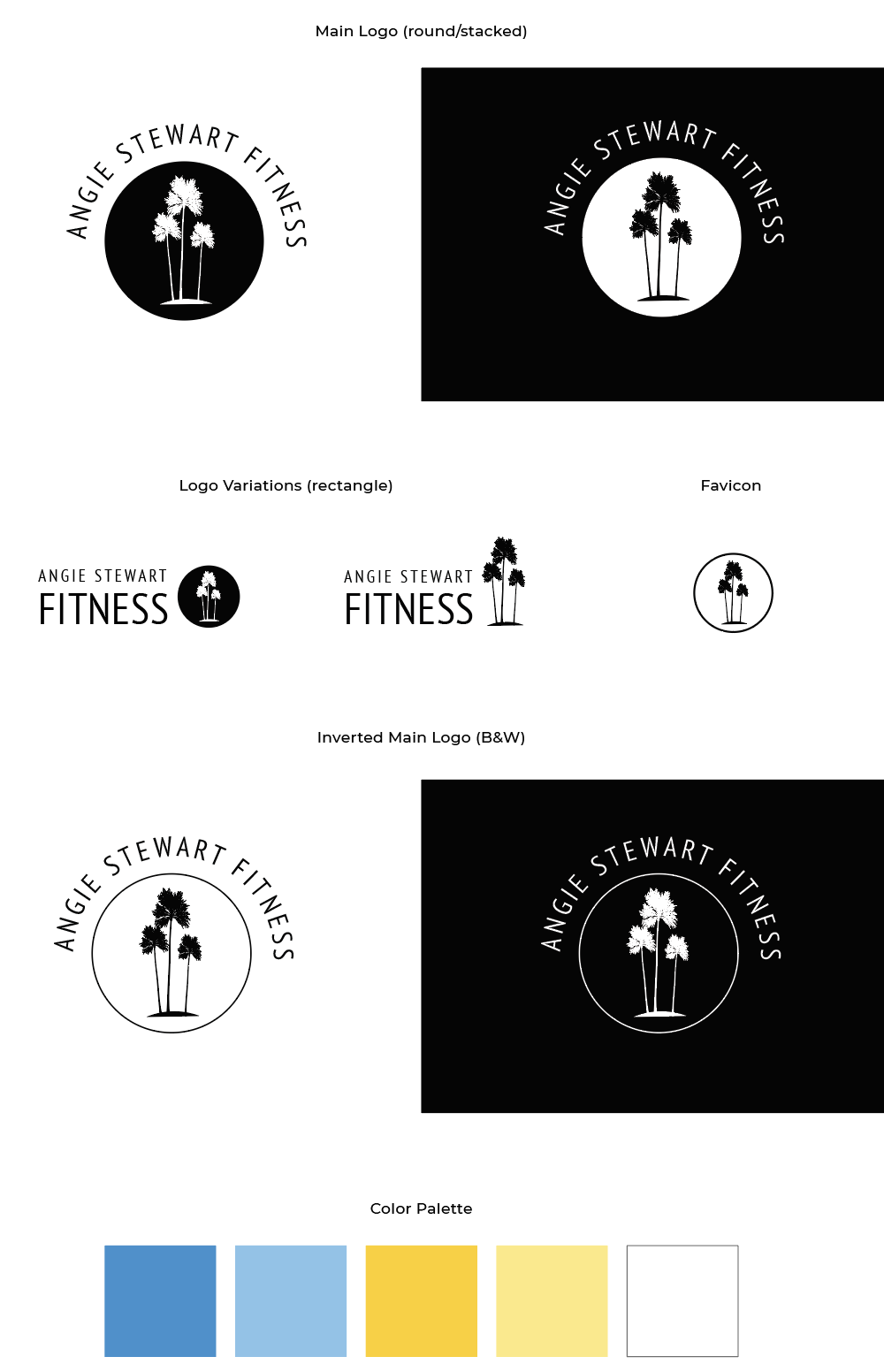
Angie's goals for the website and brand were to be fresh, new, clean, and vibrant. We discovered this through our exploration phase as we went through many different concepts. Angie is empathetic and wants her site to emulate who she is and how she can help others with what she knows best, fitness. Family is at the core of everything Angie does, so we incorporated the iconic California palm trees in her logo that remind her of raising her family in California.
I started with sketching around a few key ideas:
I then moved to the computer to continue iterating on the designs and explore color & typography options. Angie wasn't quite clear on her vision at this stage so I came up with 5 very different boards to see what she was drawn to based on the logos we'd narrowed down together.

She resonated with the blue and yellow version (3) as well as the peach (1), so I moved on to iterating site layout concepts. I also took this time to create some logos on the computer, since we had more of a direction at this point.


After deciding to move forward with the blue and yellow theme I worked on the palm tree logo and brightening up the blue and yellow homepage. As the logo evolved we implemented a circular theme that is reminiscent of the sun, paired with the bright sky blue and sunshine yellow brand colors it gives a sunny California vibe without being child-like.

After the homepage was done, I prepped the styles for the development team. Adobe XD provides development specs, but this document also serves as a great resource for Angie and her brand.

While the brand needed updating, all the products with the old branding did as well. I recommended while the site is developed that we upgrade them.


Full website redesign of LLSC with UX treejack testing, mockups, and a style guide.

The goal of this project was to create a clean, one-page portfolio site that showcased Anthony's skills and matched his personality.

This was a creative vision for a text and content-heavy website for a sales bid.
I'm a UX/UI Designer with a passion for user understanding and a keen eye for details.